Self-Checkout Is Not a Staff Replacement: How to Build Faster, Safer, and More Accessible POS Experiences in 2026
A practical guide to designing self-checkout, scan-and-go, mobile POS, and assisted checkout around real customer needs, staff workflows, accessibility, fraud controls, and reliable store operations.
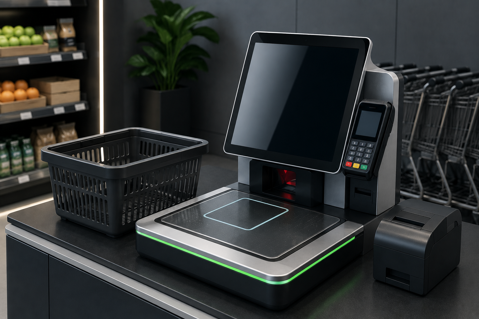
Self-Checkout Changes the Job—It Does Not Remove It
At 6:30 p.m., a supermarket can have ten self-checkout stations open and still feel slower than a store with four staffed lanes. One customer cannot scan fresh produce, another has an age-restricted item, a third sees an unexpected weight warning, and two people are waiting for payment assistance. The technology is present, but the operating model is missing.
Self-checkout does not eliminate work. It moves work. A cashier who once served one customer at a time may now watch several transactions, solve exceptions, approve restricted products, explain the interface, check baskets, reset devices, and calm customers who feel accused by an alert. The job becomes more parallel, more technical, and often more emotional.
A strong POS design accepts this reality. It gives the attendant a clear view of which station needs help, why it needs help, how long the customer has waited, and what action is allowed. It also makes the ordinary path genuinely easy, so staff spend their time on real exceptions rather than rescuing customers from confusing buttons.
Customers Want Speed, but They Also Want a Way Out
Some customers choose self-checkout because they have one or two items. Others want privacy, control, or a shorter queue. A parent with children may prefer a staffed lane. An older shopper may need help with payment. A customer with a full cart may simply want someone else to handle the scanning.
The correct strategy is not to force every customer into the same route. It is to offer clear choices: staffed checkout, self-checkout, mobile POS, scan-and-go, or express assistance. Choice reduces frustration because the customer can select the level of independence that fits the basket and the moment.
Every self-service flow also needs an obvious escape route. A visible help button, a nearby employee, a simple cancel option, and a clear way to transfer the sale to an attended station prevent small problems from becoming abandoned baskets or public arguments.
In practice, Design a test basket that includes produce, a discounted item, a returned item, an age-restricted product, a damaged barcode, a loyalty offer, and two payment methods. A system that handles only perfect baskets is not ready for a busy store. Do not judge labor savings by the number of staffed lanes removed. Include troubleshooting, monitoring, cleaning, cash handling, device maintenance, training, and customer recovery. This should be reviewed with staff after the first week, because real customer behavior exposes details that a demonstration cannot.
Accessibility Must Be Designed In from the First Screen
Accessibility is not a final checklist added after installation. It begins with readable type, high contrast, large touch targets, consistent button placement, understandable icons, audio support, tactile controls where relevant, adjustable volume, and enough time to complete each step.
Consider the customer who cannot distinguish low-contrast text, the shopper who uses a wheelchair, the person who cannot hear a spoken prompt, or the customer whose hands make precise tapping difficult. A checkout that works only for an average user is not a complete retail system.
Accessibility also helps everyone during stress. Large buttons are easier when a customer is holding a bag. Clear language helps tourists and new users. Fewer unnecessary screens reduce errors for all shoppers. Inclusive design usually creates better design.
Loss Prevention Works Better When the Experience Is Clear
Retailers often respond to self-checkout loss by adding more warnings, more cameras, more weight checks, and more interruptions. These controls may reduce some risks, but excessive friction can make honest customers feel watched and can overwhelm attendants with alerts.
A better approach combines clear product images, reliable barcode data, sensible weight tolerances, fast attendant review, targeted rules for high-risk items, receipt checks based on risk, and analysis of repeated patterns. One unusual event is not the same as repeated suspicious behavior.
Good prevention starts before the payment screen. Accurate product setup, clear produce lookup, correct units, working scanners, visible bagging instructions, and simple promotion logic reduce accidental non-scans. The system should separate confusion from deliberate abuse whenever possible.
In practice, Place the attendant where customers can see and reach them. A hidden employee may technically monitor the area but cannot create confidence or respond quickly. Test the interface in bright light, low light, noise, and peak-hour pressure. A screen that looks excellent in a demo room may become difficult in a real shop. This should be reviewed with staff after the first week, because real customer behavior exposes details that a demonstration cannot.
Choose the Right Checkout Mix for the Store
Checkout format should match the store mission. A convenience shop with small baskets may benefit from compact self-checkout. A fashion store may gain more from mobile POS employees who complete payment on the floor. A grocery store may need a mix of staffed lanes, basket-only self-checkout, and assisted stations for larger shops.
Look at basket size, product type, age restrictions, cash usage, customer demographics, peak periods, accessibility needs, available floor space, and the amount of staff intervention required. A popular technology in another chain may be wrong for your location.
Measure the entire experience, not just the number of customers who used self-service. Track queue time, transaction time, intervention rate, abandoned transactions, payment failure, rescans, customer complaints, employee workload, accessibility requests, and loss rate.
A Practical Rollout Plan for Self-Service POS
Begin with a limited pilot and keep staffed alternatives open. Observe real customers instead of relying only on surveys. Watch where they pause, which prompts they misunderstand, how attendants move between stations, and what happens when several exceptions occur at once.
Train employees as service specialists, not guards. They should understand the technology, the fraud policy, the accessibility features, the escalation path, and the language that helps a customer without making an accusation.
Dashierly or any POS should be assessed by how well it supports the complete checkout environment: reliable product and price data, clear permissions, mobile selling, returns, alerts, audit history, inventory updates, payment handling, and reporting. Self-service succeeds when the software and the human operation support each other.
In practice, Review the most common intervention reasons every week. If the same warning appears hundreds of times, the workflow or data may be wrong—not the customers. Place the attendant where customers can see and reach them. A hidden employee may technically monitor the area but cannot create confidence or respond quickly. This should be reviewed with staff after the first week, because real customer behavior exposes details that a demonstration cannot.
Keep reading
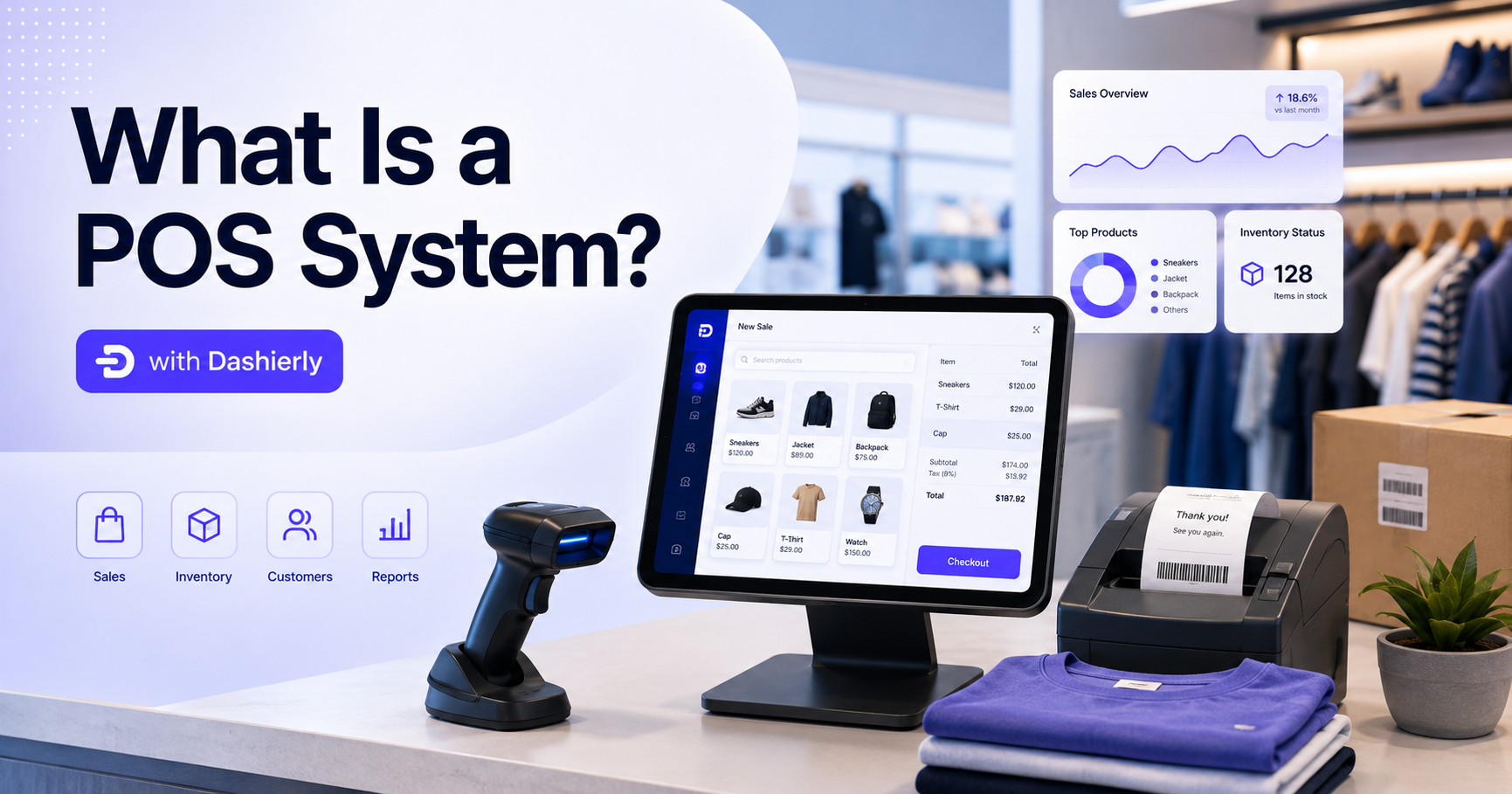
What Is a POS System? A Complete Guide to Modern Retail Management with Dashierly
Discover how a modern POS system helps retail businesses manage sales, inventory, invoices, returns, suppliers, customers, accounting, employees, branches, and reports. Learn what to look for when choosing retail software and how Dashierly brings daily store operations together in one connected platform.
Read article
How to Prevent Stockouts and Overstock with a POS Inventory System in 2026
Learn how a modern POS inventory system helps retailers reduce stockouts, avoid overstock, improve inventory accuracy, automate low-stock monitoring, and make smarter purchasing decisions. See how Dashierly connects sales, stock, supply, returns, reports, and branches in one retail platform.
Read article
AI-Powered POS Systems in 2026: The Future of Smart Retail Management
Explore the biggest POS trends of 2026, including AI analytics, predictive inventory, mobile checkout, cloud operations, and unified retail data—and learn how Dashierly helps stores build a future-ready foundation.
Read article